Transforming a Booking Form into a Seamless Experience
Case Study – UI/UX Design
Year
Spring 2022
Mediums
Figma
Photoshop
Illustrator
Role
UX Design
Visual Design
Interaction Design
Prototyping
User Testing
LASIK MD, a leading laser vision correction provider in Canada, faced challenges with an outdated, non‑optimized booking form that hindered the user experience, resulting in lower conversions and increased drop‑off rates.
As a designer on the Marketing team working closely with the Creative Team Leader, my main responsibility was revamping the UX and UI design of the booking form to improve the experience for new patients while meeting marketing and lead‑generation goals. In collaboration with a cross‑functional team, we focused on streamlining the design and delivery process as efficiently as possible.
The Problem
Booking a consultation is a patient’s first step in their care journey, yet the old booking form made it frustrating. New patients faced an unclear flow, poor mobile UX, and outdated visuals that didn’t reflect the brand or modern UI standards. This confusion lowered engagement and increased drop‑offs, leaving patients uncertain and clinics with missed opportunities. Our team aimed not just to improve usability, but to create a welcoming, trustworthy first impression that reflected the quality of care patients could expect.
The Solution
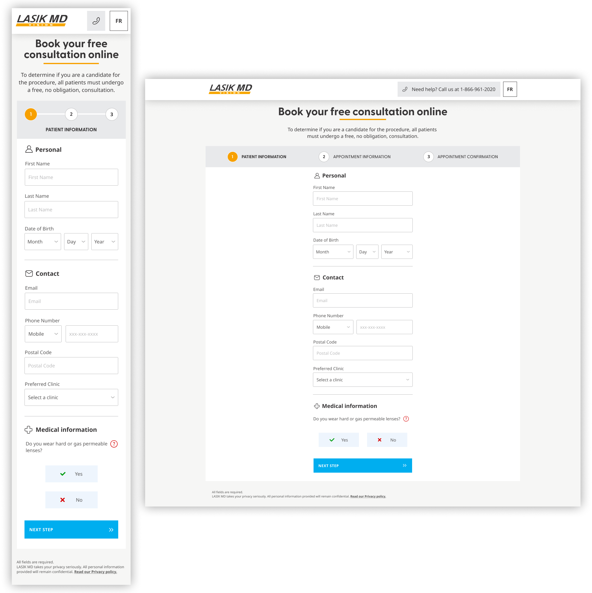
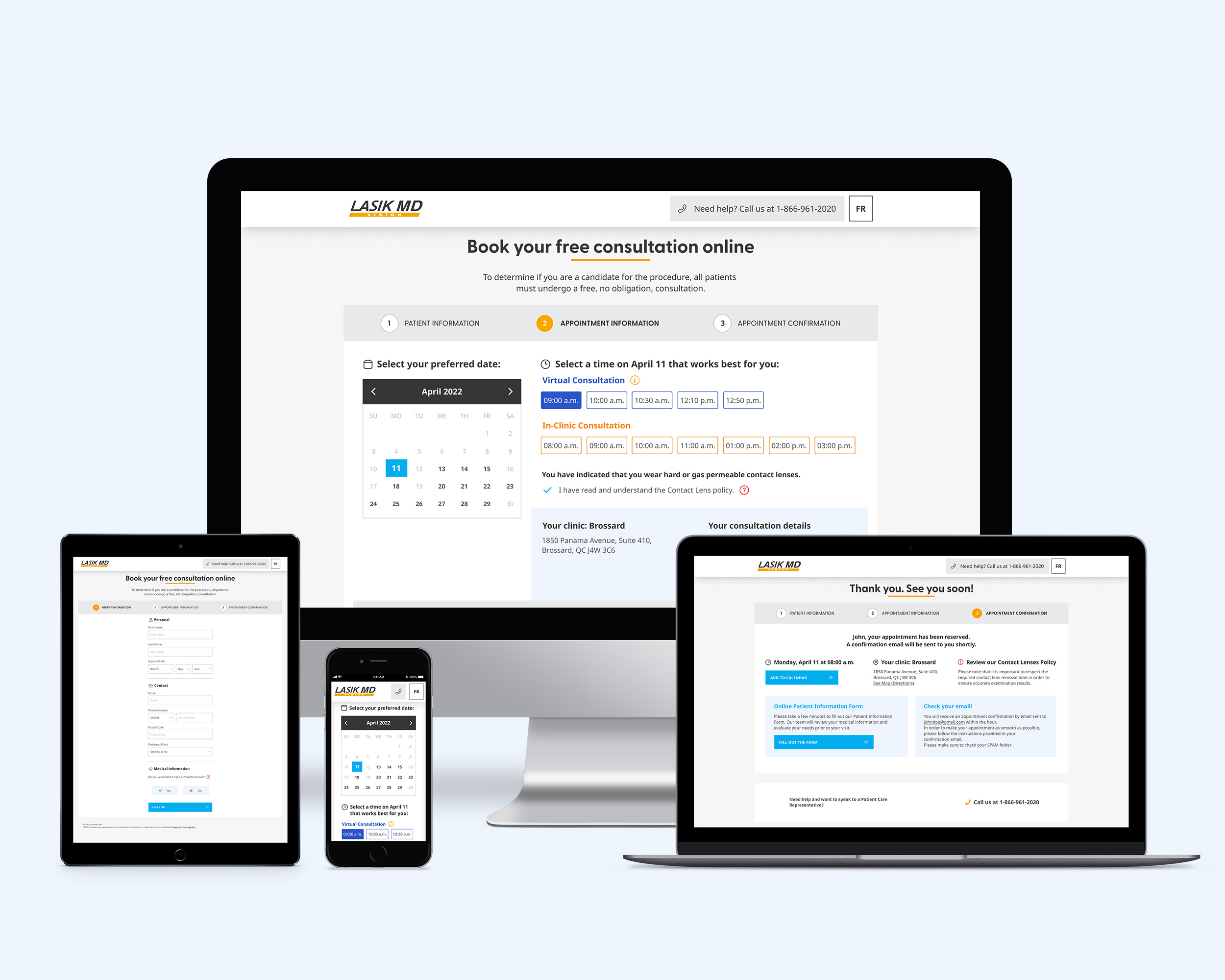
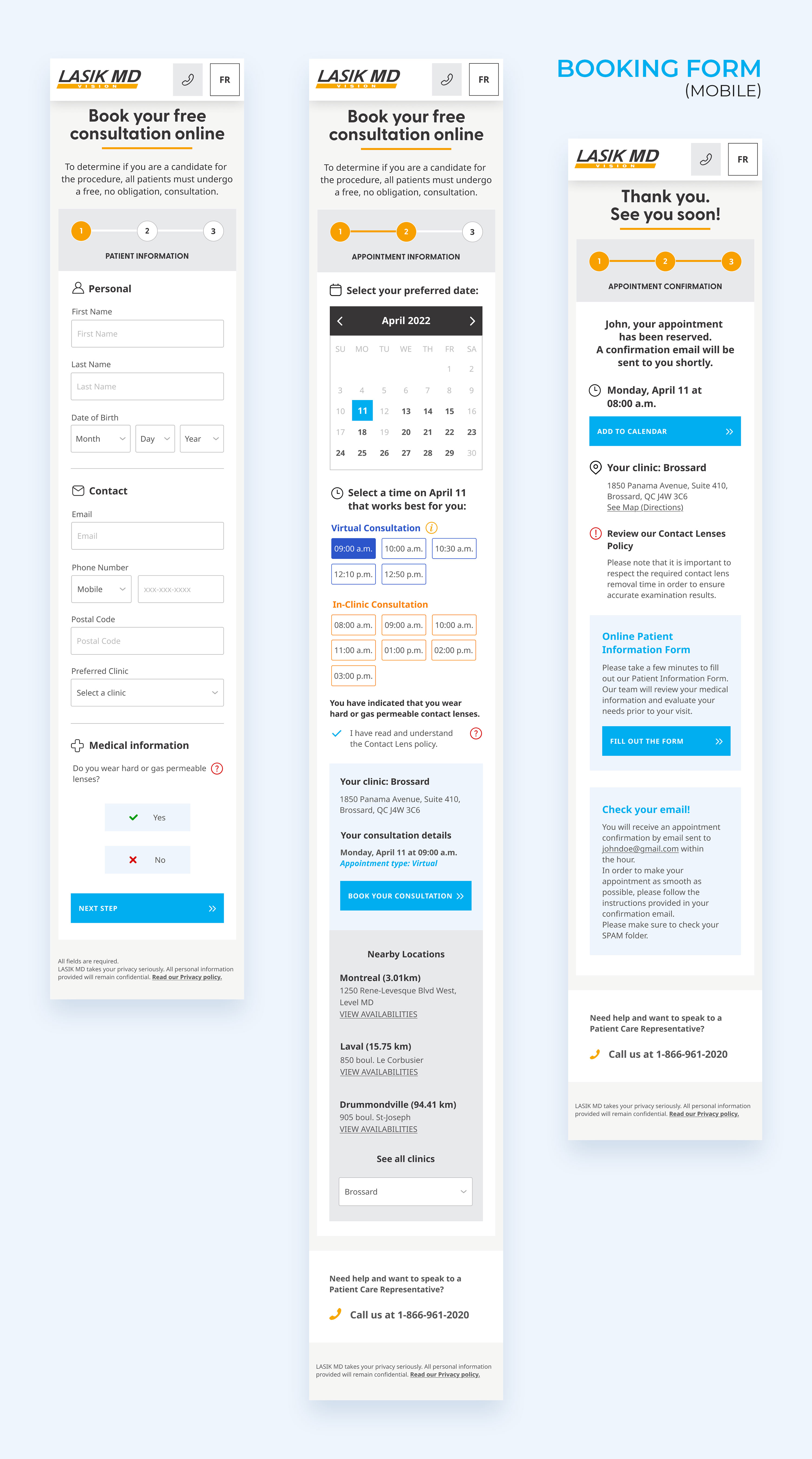
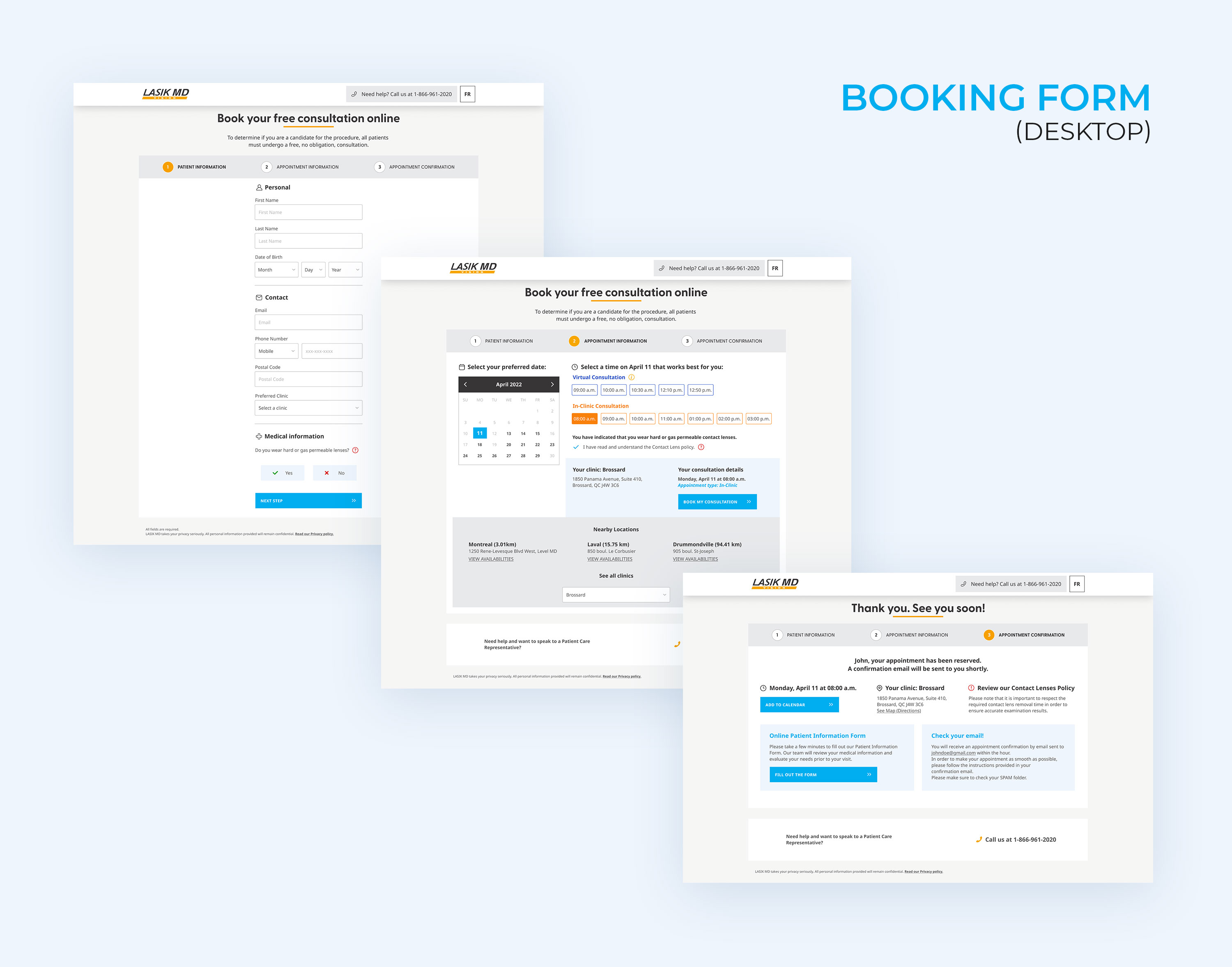
Our final solution redesigned LASIK MD’s online booking with a simplified step‑by‑step layout, clear visual hierarchy, and concise labels. To speed up form completion, we removed the age group segmentation landing page and used patient age to determine available consultations.
We added three key features to improve booking flow and mobile usability:
- A calendar displaying available times for virtual and in‑clinic consultations at the preferred clinic.
- An option to view nearby clinics and their availability.
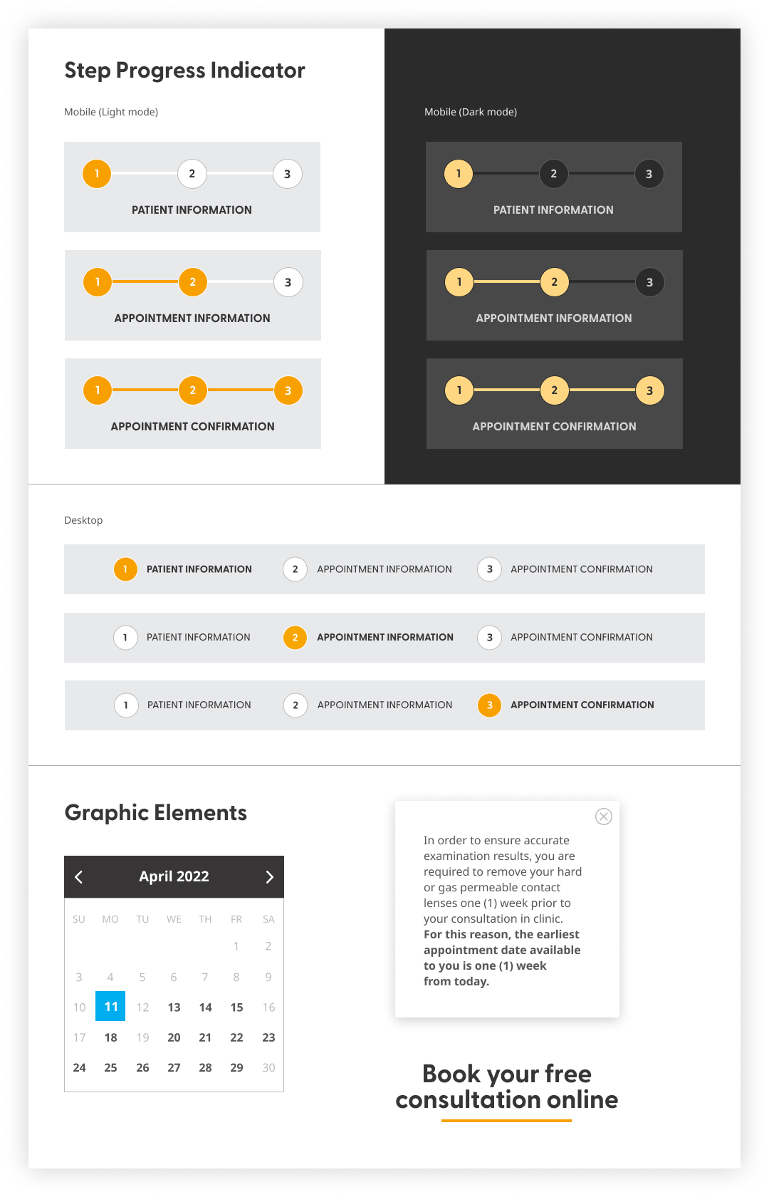
- Modal windows with details on the virtual consultation process and contact lens policy.
Initial Insights
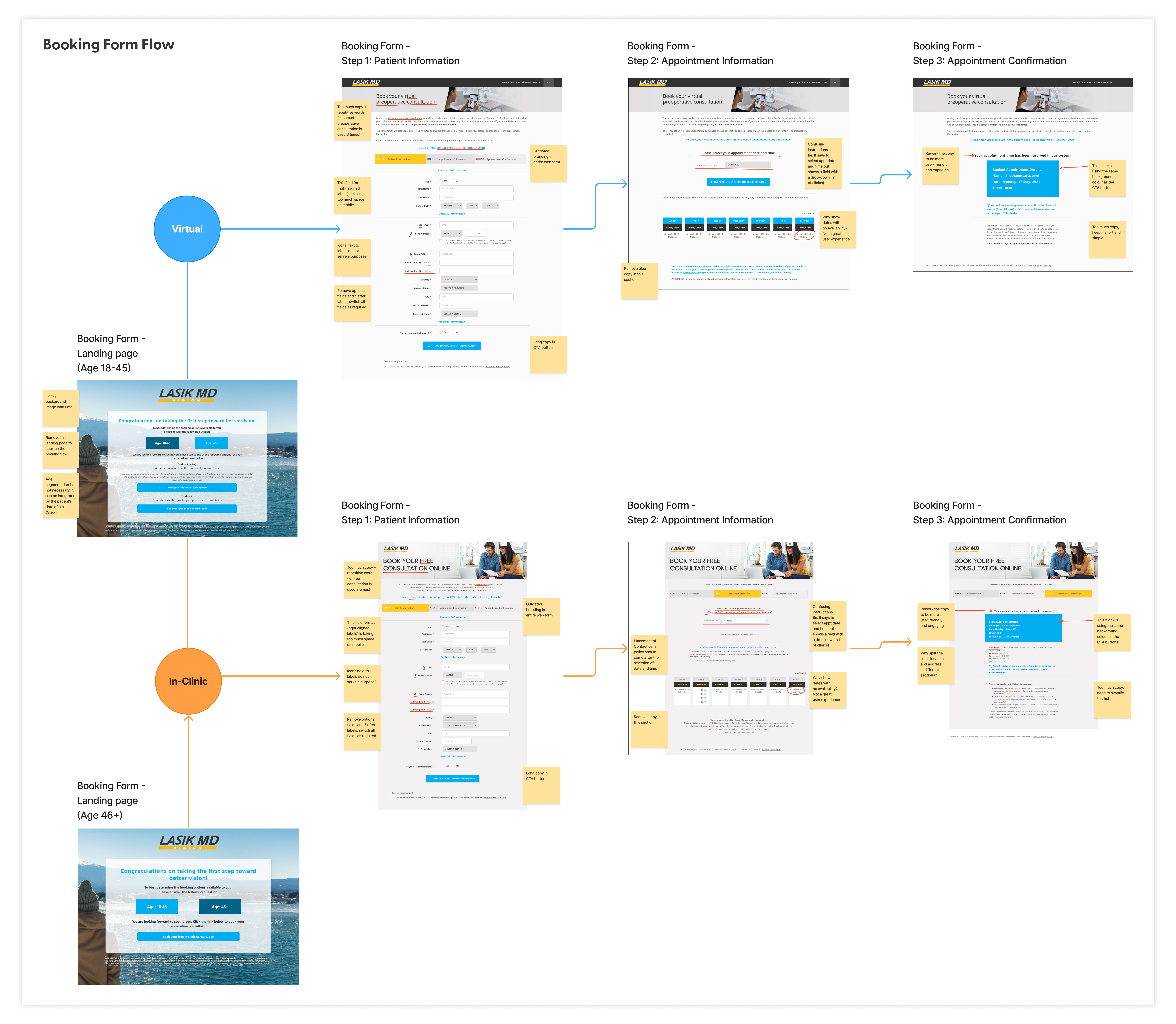
We began with a booking form audit to understand why users were struggling. From a new patient’s perspective, the confusing layout and lack of clear visual cues made navigation frustrating—especially on mobile. On top of that, separating patients by age into different virtual or in‑clinic forms added unnecessary complexity, leaving new patients feeling unsure and slowing down the booking process. Other noticeable pain points—such as heavy image load times and a confusing date and time picker that displayed unavailable options—further contributed to a discouraging and inefficient user experience.
Check out the observations found in the booking form flow.
Constraints and Challenges
Redesigning the booking form meant navigating strict requirements and competing priorities. Certain data fields—like full name, date of birth, contact info, and medical history—were mandatory for clinical and regulatory reasons. At the same time, the team needed to ensure the form loaded quickly, performed flawlessly on mobile, and aligned with business goals.
Marketing initially pushed for vibrant lifestyle images to match their branding, but these visuals slowed the form and distracted users. After discussions, the team removed them, creating a faster, cleaner, and more user‑focused experience—while maintaining brand consistency.
Research and Discovery
Stakeholder Input
By gathering feedback from marketing and clinical staff—who interact closely with patients—we uncovered key pain points that directly impact the user experience: an outdated design with image‑heavy pages that loaded slowly, poor mobile responsiveness, and a lengthy, cluttered form that frustrated users.
“Creatively, the current web booking form feels and looks stale. The imagery takes a longer load time, so we want the form to be ‘light’ to provide the fastest experience for the user.”
– Brand team
“74% of users are coming to our booking form on a mobile device, so we need to build it for mobile first.”
– Omnichannel team
“We have received some patients comment that the web booking form completion time took a little longer than expected.”
– Clinical staff
Competitor Analysis
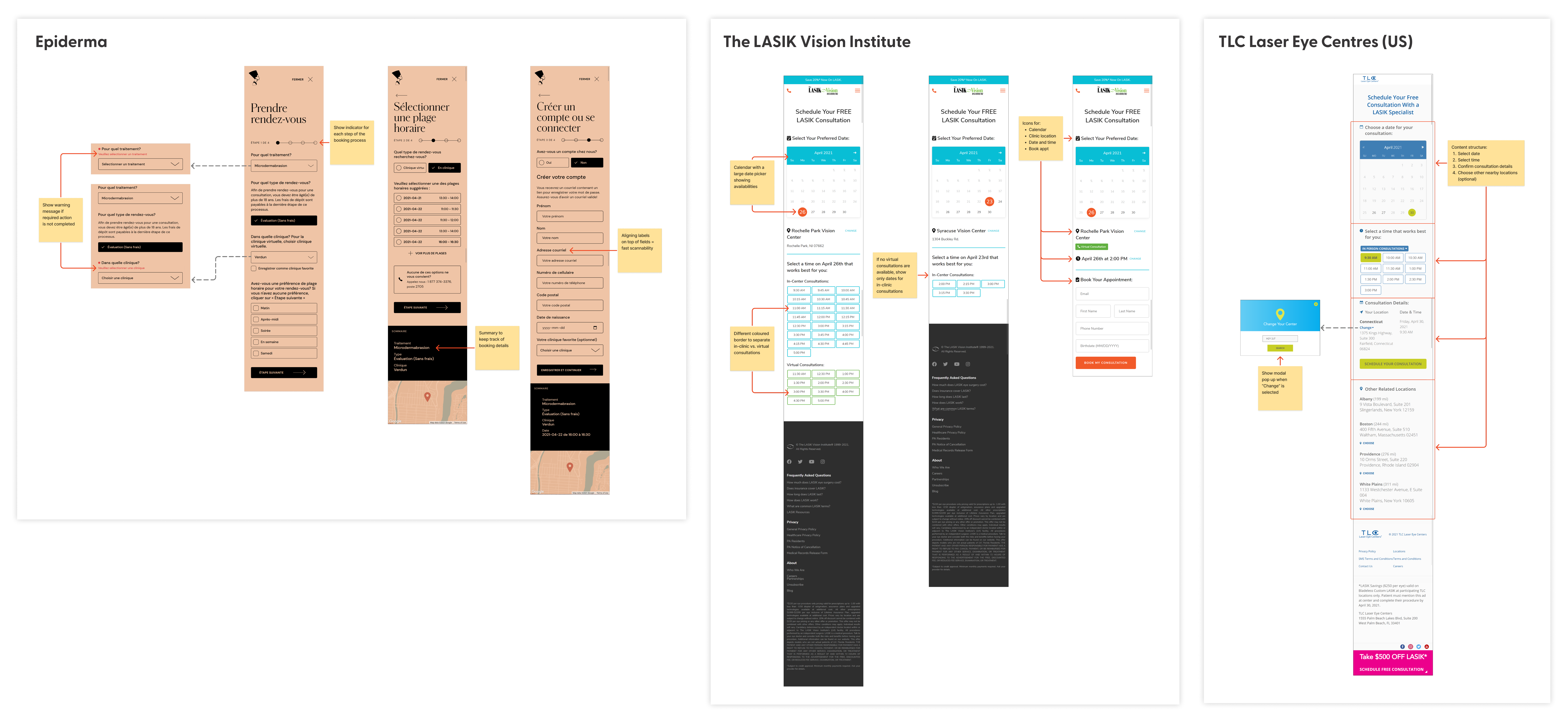
To understand what works best and where improvements were needed, we dove into a comparative analysis of three healthcare booking systems—examining their simplicity, layout, interaction flows, and how well they performed on mobile devices.
Key Findings
- Simplicity: Competitors that used a calendar date picker streamlined the process by showing only available dates and times, removing guesswork.
- Layout: Clean visual hierarchy made information easier to scan and reduced cognitive load.
- Interaction Flows: Well‑structured step‑by‑step processes kept users on track and minimized drop‑offs.
- Mobile Responsiveness: Systems optimized for small screens provided smoother, more intuitive booking experiences.
These insights were instrumental in the redesign of the booking form, guiding our decisions to implement a calendar date picker, clear hierarchy, step‑by‑step flows, and a fully responsive mobile experience.
Check out the full competitor analysis.
User Assumptions
Next, we segmented our two core user profiles based on age, which directly influenced the type of vision correction procedure and consultation options offered:
- Patients under 39 (previously under 45) were eligible for Laser Vision Correction, with both virtual and in‑clinic consultations available.
- Patients 40 and older (previously 46+) qualified for Intraocular Lens procedures, limited to in‑clinic consultations only.
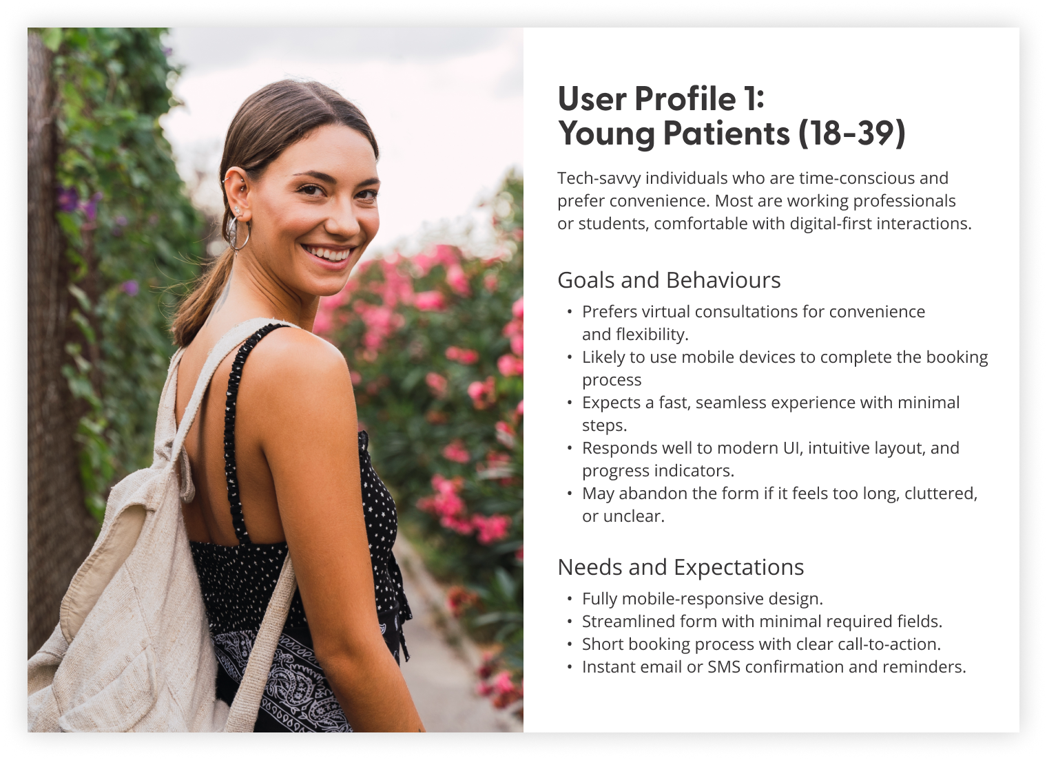
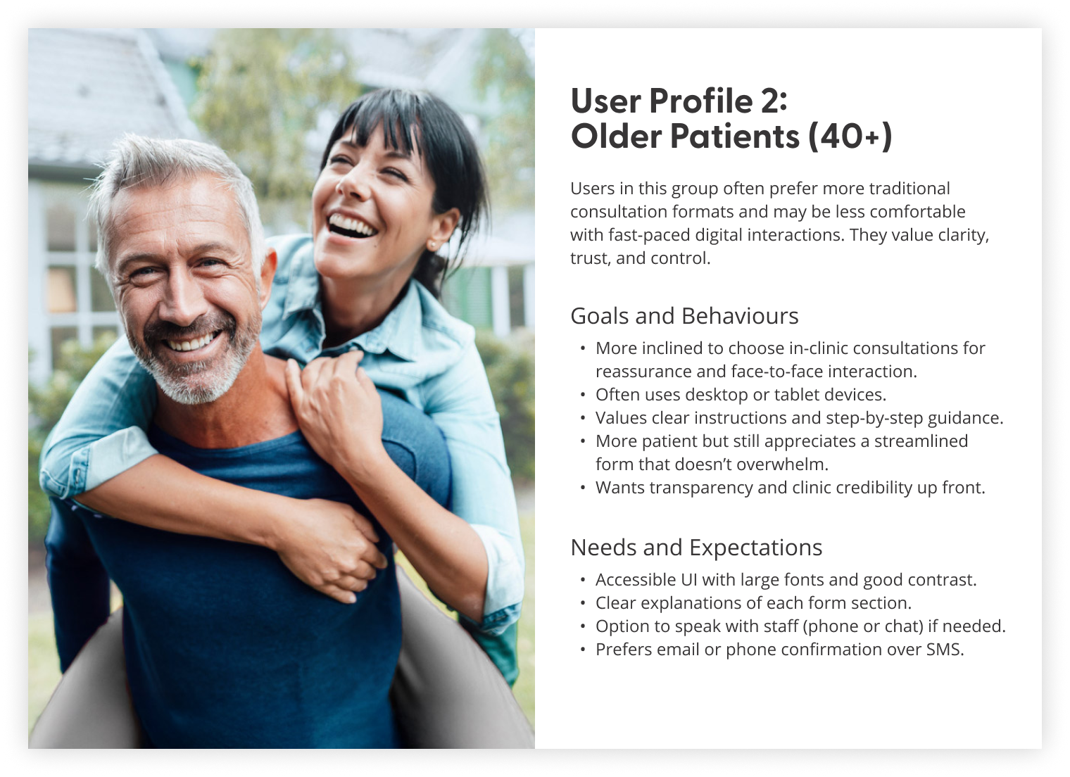
Through internal testing, it became clear that our users highly valued speed and clarity when booking their appointments online—insights that shaped our design approach moving forward.
UX Strategy
Information Architecture
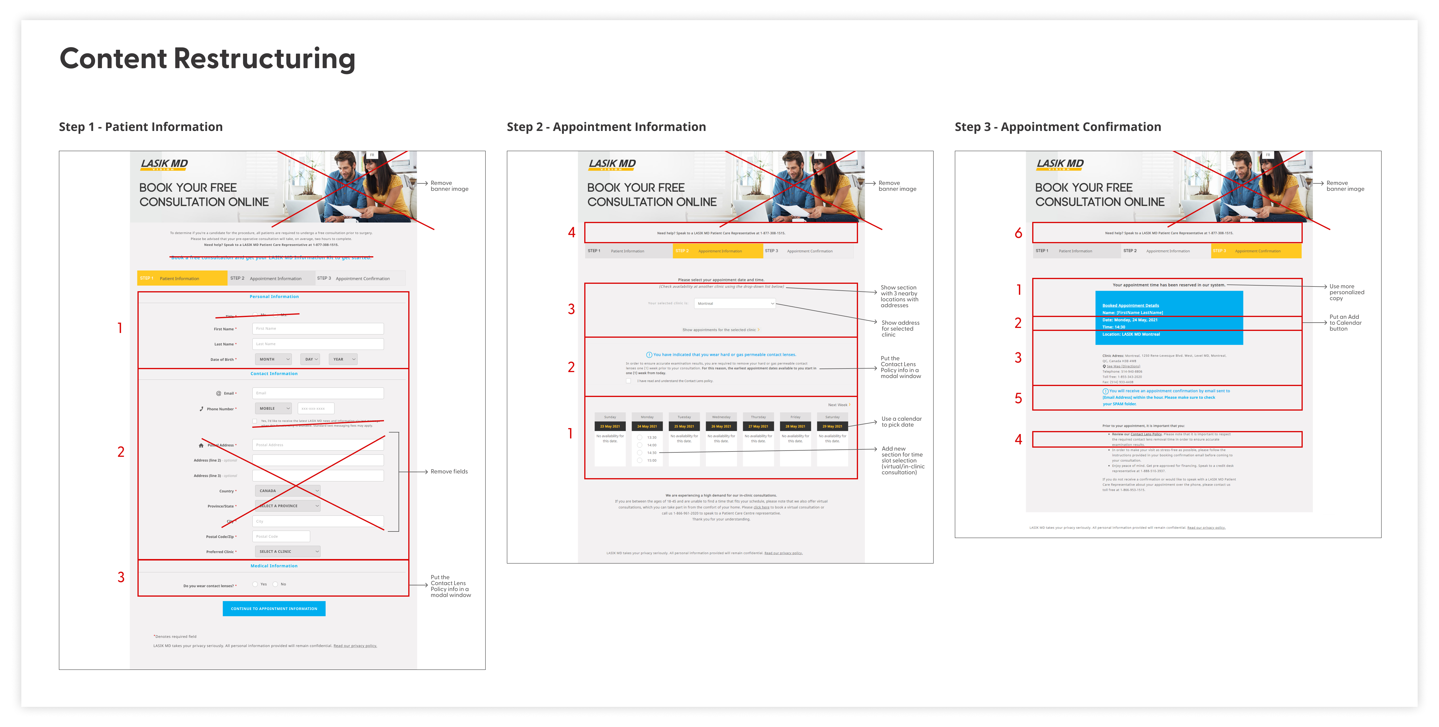
Based on our findings, we restructured the booking form’s content and information architecture to improve flow and usability. We reduced input fields and added modal windows for progressive disclosure, easing the visual and cognitive load on users.
Check out the content restructuring and information architecture map.

User Flow
Following that, we mapped the new patient’s booking flow to gain a clear understanding of the redesigned process and ensure alignment with business objectives. Incorporating a user scenario and job story validated that the flow effectively met user needs.
User scenario
Situation: John (30), a new patient, is planning to have LASIK eye surgery and wants to book an appointment for an in‑clinic consultation near his area.
Motivation: John wants a seamless and convenient online booking experience that he can complete on his mobile phone.
Outcome: Using the web booking form, John can easily select his preferred appointment date and time at the closest clinic, ensuring a quick and smooth booking experience for his LASIK eye surgery consultation.
User job story
“I’m planning to get LASIK eye surgery, so I need to book a consultation to see if I’m eligible. I want to book my appointment quickly and easily on my mobile phone, looking for the earliest available slots at the closest clinic in my area.”
Check out the improved user flow.

Wireframes and Mid‑Fidelity Concept
I created mid‑fidelity wireframes to visualize the booking form’s interface and added interactions to ensure a seamless, mobile‑first, responsive user flow.
Check out the final iteration of mid‑fidelity wireframes.

Visual Design
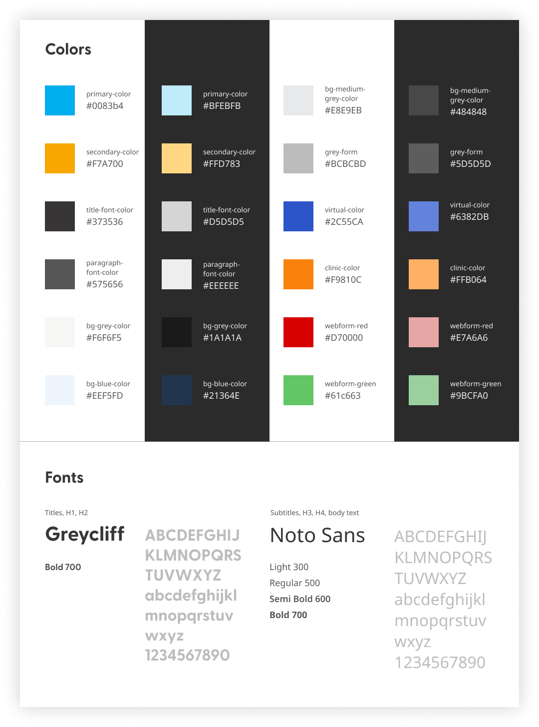
I defined the visual design styles and components to build a consistent, brand‑aligned prototype. Every element was crafted with modern design principles in mind, using an 8pt responsive grid layout and designed for both light and dark modes.


User Testing
With limited budget and time, we tested the prototype internally—first with IT and development teams, then with testers representing our target users on mobile and desktop. Testers were asked to rate the form’s clarity and completion time.
Feedback highlights
- Simplified layout and consistent branding were well received
- Shorter form with modals made booking faster and easier
- Visual cues improved navigation
Changes after testing
- More personalized, user‑focused copy
- Separate booking page for existing patients
Results and Takeaways
The launch of the redesigned booking form turned a once‑frustrating process into a smooth, intuitive journey. Patients completed bookings nearly 40% faster, navigating a clean, step‑by‑step layout on both desktop and mobile. Internal testers unanimously preferred the new form, calling it faster, clearer, and more reassuring—finally reflecting the clinics’ care standard.
Revamping the booking form taught me the importance of framing it as a conversation—using empathetic language and a logical flow to create a more human‑centered experience. I also learned that simplifying complex logic into a single adaptive flow reduced user confusion and made the system easier to maintain.
Next Steps
The project is still ongoing as we continue monitoring booking form completion rates from real users, explore A/B test refinements, and investigate additional CRM integration features to enhance the user experience and streamline lead management.
Check out the live booking form.
